BLUE MONDAY
BLUE MONDAY
BLUE MONDAY
BLUE MONDAY
Logo and Poster Design
Logo and Poster Design
2020
2020
"Every damn Monday, a concert will save you, again as always, but not only, every Monday at the Fico."
"Every damn Monday, a concert will save you, again as always, but not only, every Monday at the Fico."
"Every damn Monday, a concert will save you, again as always, but not only, every Monday at the Fico."
"Every damn Monday, a concert will save you, again as always, but not only, every Monday at the Fico."
BACKGROUND
BACKGROUND
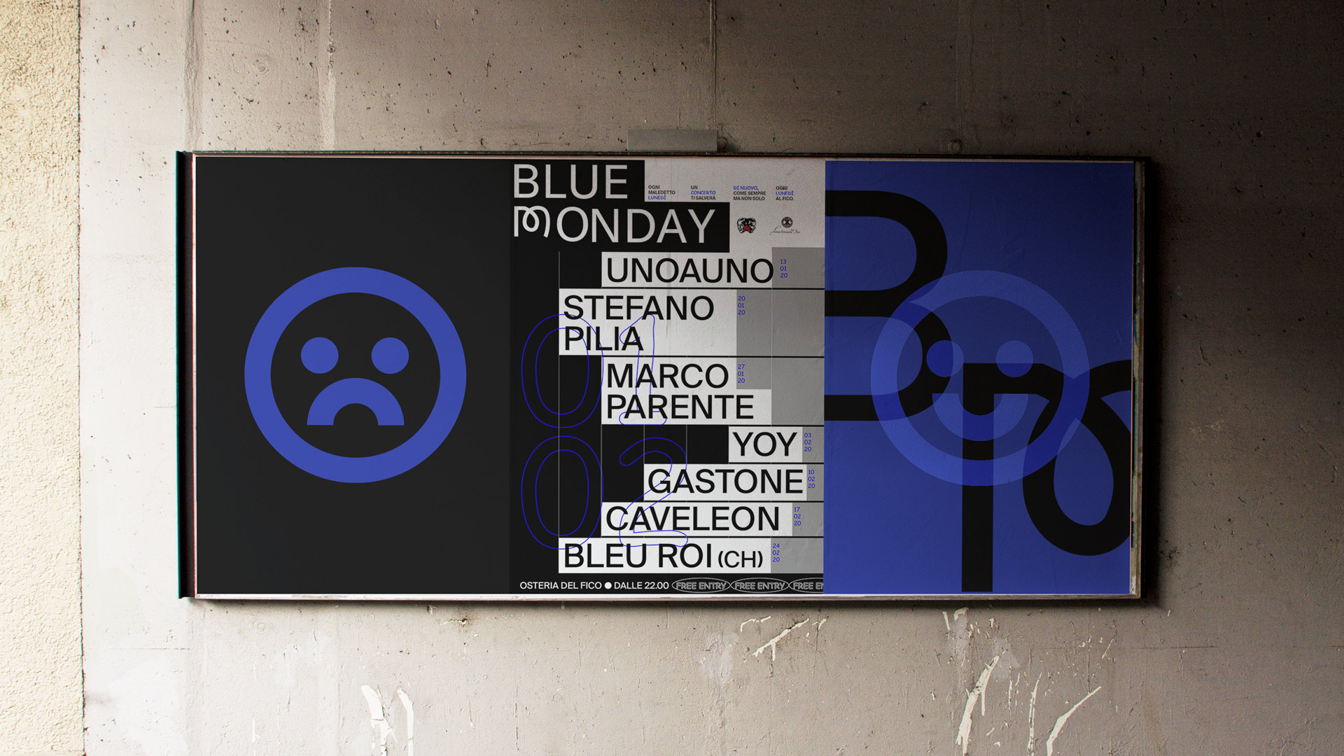
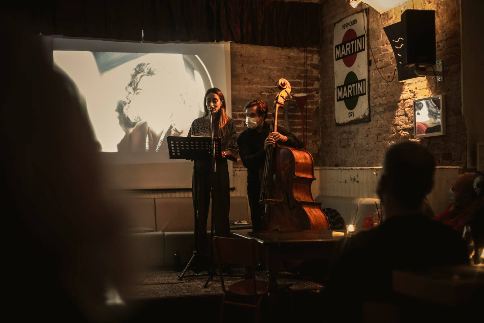
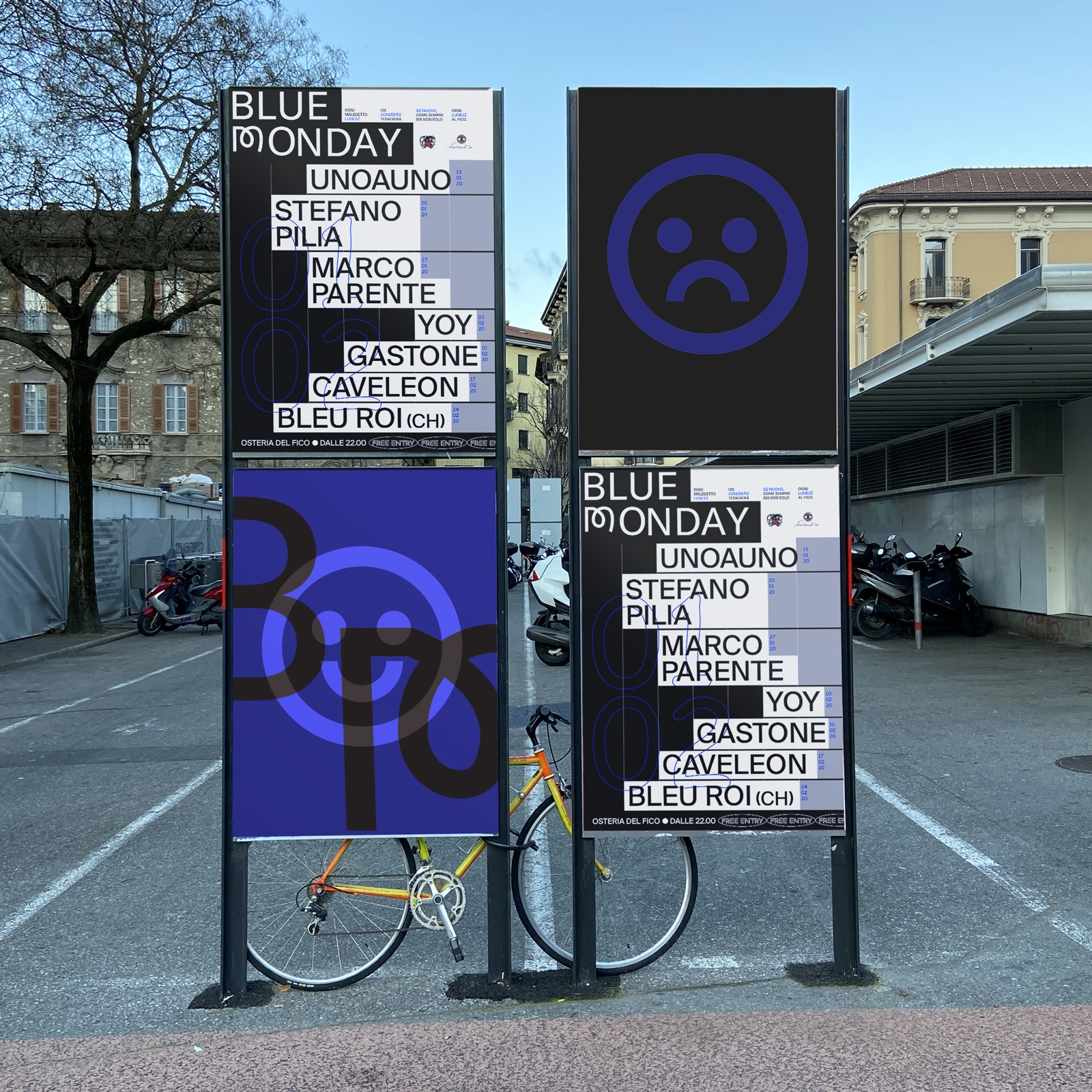
BlueMonday is a series of musical concerts on Monday evening in the Osteria del Fico, aimed at giving the guests a charge to face the rest of the week.
BlueMonday is a series of musical concerts on Monday evening in the Osteria del Fico, aimed at giving the guests a charge to face the rest of the week.
BlueMonday is a series of musical concerts on Monday evening in the Osteria del Fico, aimed at giving the guests a charge to face the rest of the week.
BlueMonday is a series of musical concerts on Monday evening in the Osteria del Fico, aimed at giving the guests a charge to face the rest of the week.

I wanted to represent the "Monday mood variation" using 2 different (and pretty opposite) typefaces to conceptualize the "ok, be serious, let's start this week" phase of the day, with the more common "sh*t I wanna freak out" moment.
That's why Suisse Int’l is used throughout in contrast with moments of Comic Sans (as a guest typeface).
Colors are black and white with a pinch of electric blue, to have both serious and freaky sensations coming out.


INSTAGRAM PERSONAL PROFILE / GRAFFITI WRITING PROFILE // EDOARDO COMPIANI 2021 ALL RIGHTS RESERVED © // SAY HI!
INSTAGRAM PERSONAL PROFILE / GRAFFITI WRITING PROFILE // EDOARDO COMPIANI 2020 ALL RIGHTS RESERVED © // SAY HI!
INSTAGRAM PERSONAL PROFILE / GRAFFITI WRITING PROFILE // EDOARDO COMPIANI 2020 ALL RIGHTS RESERVED © // SAY HI!
INSTAGRAM PERSONAL PROFILE / GRAFFITI WRITING PROFILE // EDOARDO COMPIANI 2020 ALL RIGHTS RESERVED © // SAY HI!
INSTAGRAM
PERSONAL PROFILE
GRAFFITI WRITING PROFILE
2020 ALL RIGHTS RESERVED ©
SAY HI!