MINUSCOLO CORSIVO
MINUSCOLO CORSIVO
MINUSCOLO CORSIVO
MINUSCOLO CORSIVO
MINUSCOLO CORSIVO
BRAND IDENTITY
2017
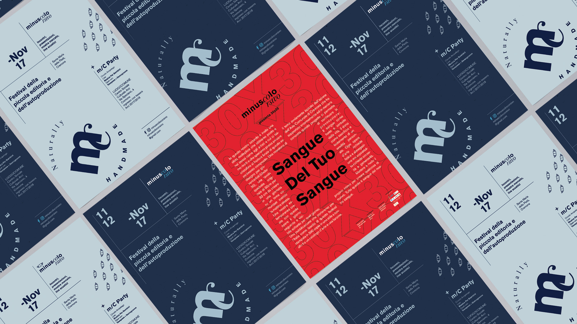
Minuscolo Corsivo is a festival dedicated to small publishing, held every year in Cremona, Italy.
Meetings, presentations, market exhibition, acoustic performances.

PROBLEM INTRODUCTION
PROBLEM INTRODUCTION
When I was commissioned to do this, the client asked me to redesign an identity that already exists, but was previously "homemade".
He specified that he needed a complete, solid coordinated image and that it represented the genuineness of the independent editorial product that the festival wants to present in a rather immediate way.
Starting from these assumptions, I developed the logo with a pair of typographic characters that represent the very meaning of the words "minuscolo" and "corsivo", which therefore mean "lowercase" and "italic" respectively.
The color palette is light, desaturated, to reflect the sense of authenticity and naturalness. The colors are laid flat, without nuances so that they can express more solidity.
Stains, recycled paper, clearly visible construction grids, dynamic interspersing of the two typographic characters and simplicity are the attributes that characterize this project.
WHAT I DID
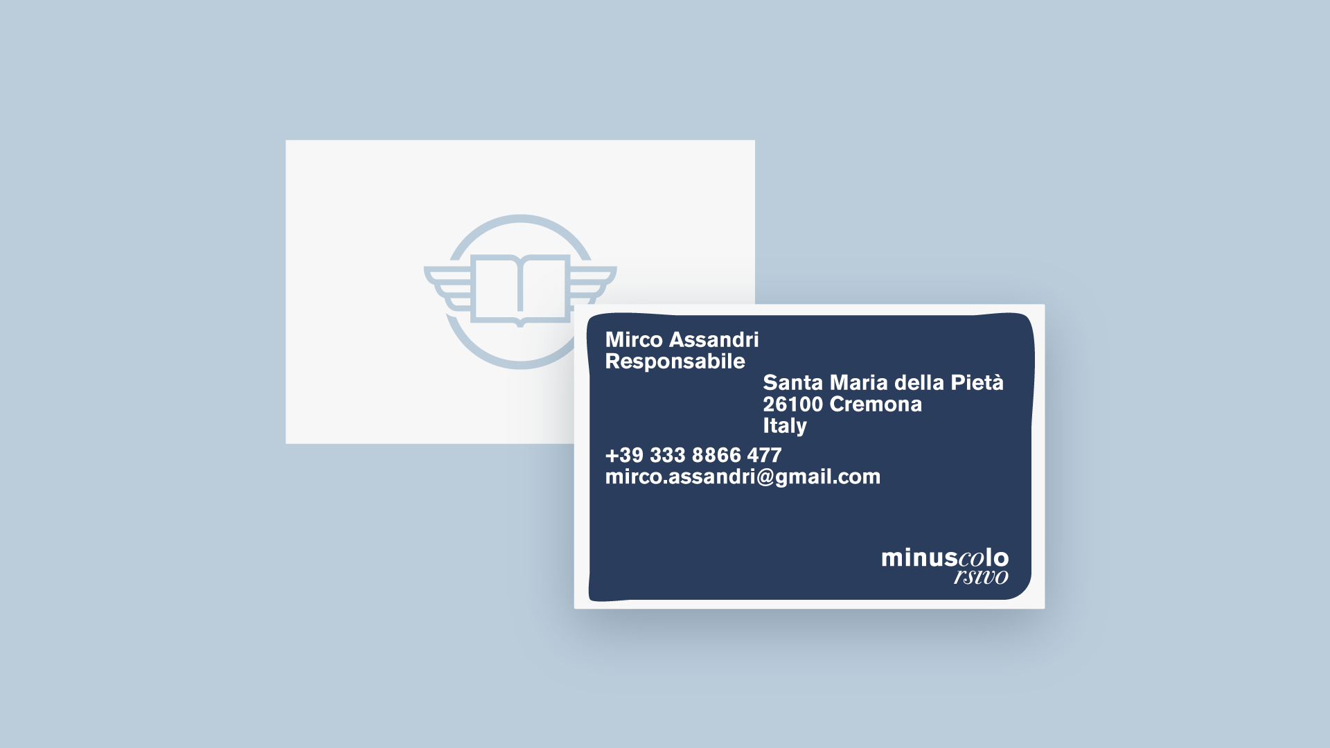
Logo design
Development of promotional printed and digital material


INSTAGRAM PERSONAL PROFILE / GRAFFITI WRITING PROFILE // EDOARDO COMPIANI 2021 ALL RIGHTS RESERVED © // SAY HI!
INSTAGRAM PERSONAL PROFILE / GRAFFITI WRITING PROFILE // EDOARDO COMPIANI 2020 ALL RIGHTS RESERVED © // SAY HI!
INSTAGRAM PERSONAL PROFILE / GRAFFITI WRITING PROFILE // EDOARDO COMPIANI 2020 ALL RIGHTS RESERVED © // SAY HI!
INSTAGRAM PERSONAL PROFILE / GRAFFITI WRITING PROFILE // EDOARDO COMPIANI 2020 ALL RIGHTS RESERVED © // SAY HI!
INSTAGRAM
PERSONAL PROFILE
GRAFFITI WRITING PROFILE
2020 ALL RIGHTS RESERVED ©
SAY HI!